Ever wondered why some people always look effortlessly stylish — even in the simplest clothes? The secret often lies not in the brand or price tag, but in color coordination. Mastering color is like learning a visual language — one that can transform your outfit from ordinary to unforgettable.
The Psychology Behind Color Coordination
Colors are not just shades; they are emotions, stories, and identities. How you use them speaks volumes before you even say a word.
How Colors Affect Mood and Style
Think about it — have you ever felt more confident in a bold red dress or calmer in a light blue shirt? That’s no coincidence. Warm colors like red, orange, and yellow radiate energy and passion, while cool colors like blue and green evoke calm and confidence.
Understanding Personal Color Preferences
We’re all drawn to certain colors, often subconsciously. The trick is learning why — perhaps it’s how they complement your tone, or simply how they make you feel. Once you understand this connection, you’ll start dressing more authentically and stylishly.
The Foundation of Color Theory in Fashion
Color theory may sound technical, but it’s actually the creative backbone of great fashion choices.
Primary, Secondary, and Tertiary Colors
At the heart of color theory lies the color wheel — a simple yet powerful tool.
- Primary colors: red, blue, yellow
- Secondary colors: green, orange, purple
- Tertiary colors: combinations of the above
Learning how these interact helps you mix and match without clashing.
Complementary and Analogous Harmony
Complementary colors (like blue and orange) contrast beautifully, making both shades pop. Analogous colors (like green, teal, and blue) create a smooth, visually pleasing transition. It’s like balancing flavor in a dish — contrast gives excitement; harmony gives comfort.
The Role of Neutrals
Neutrals — black, white, beige, gray, and navy — are the backbone of any wardrobe. They’re like the quiet friends that make everyone else shine. Use them to ground bold tones or to create minimalistic elegance.
Understanding Skin Undertones and Color Matching
Before diving into trends, let’s get personal — your skin undertone dictates which colors make you glow.
Cool, Warm, and Neutral Undertones
- Cool undertones: Pink, red, or bluish hues under the skin. Best matched with jewel tones like emerald, sapphire, or silver.
- Warm undertones: Golden or peachy hues. They pair beautifully with earthy colors — mustard, coral, or gold.
- Neutral undertones: A mix of both, giving flexibility with almost any color family.
Testing Your Undertone at Home
Try the vein test: look at your wrist in natural light. Green veins = warm undertones; blue/purple veins = cool; a mix = neutral. You can also hold gold and silver jewelry near your face — whichever looks more flattering hints at your undertone.
Building a Balanced Wardrobe Palette
Your wardrobe should feel cohesive, not chaotic.
The 70-20-10 Rule
This golden ratio simplifies styling:
- 70% base neutrals (e.g., black, beige, white)
- 20% complementary tones
- 10% accent colors
It keeps your wardrobe versatile and coordinated effortlessly.
Capsule Color Palette Strategy
Think of this as your fashion compass — pick 5–8 shades you love and build your wardrobe around them. This saves you time, reduces outfit overwhelm, and ensures every piece works together.
Combining Colors Like a Stylist
Even if you’re not a designer, you can dress like one. The key? Intentional color pairing.
Monochrome Looks
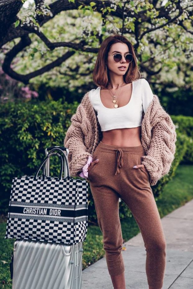
Wearing one color from head to toe can be powerful — but add variation in shade or texture to prevent it from feeling flat. For example, combine a light beige blazer with camel trousers and tan shoes for a layered monochrome look.
Contrasting for Visual Interest
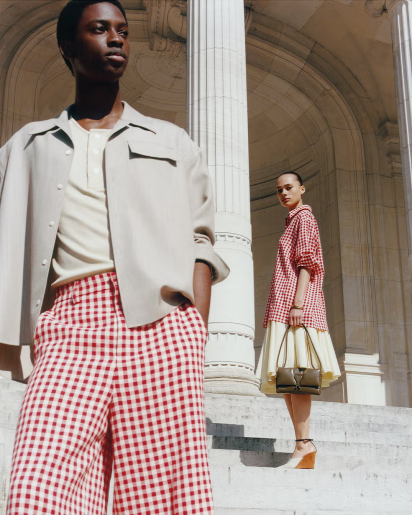
Opposites attract — in fashion too. A navy suit with a mustard shirt or a pale pink top with olive pants creates dynamic contrast. It’s daring but balanced.
Using Prints and Patterns Wisely
When wearing prints, pull colors from within the pattern to coordinate your accessories. It’s like echoing a melody — consistent yet creative.
Seasonal Color Palettes and Trends
Fashion shifts with the seasons, and color plays the starring role.
Spring and Summer Brights
Think freshness — pastel blues, mint greens, soft yellows, and coral pinks. These tones reflect light and mirror the energy of the season.
Autumn and Winter Depth
As the temperature drops, richer shades take over: burgundy, forest green, navy, and chocolate brown. They bring warmth and sophistication to cooler months.
Accessories and Accents: The Subtle Power Players
Sometimes, it’s not the outfit that changes everything — it’s the details.
Metallics, Textures, and Small Details
A metallic belt, a patterned scarf, or textured shoes can tie an entire look together. Accessories act as the punctuation marks of your outfit — they complete the sentence.
Common Mistakes in Color Coordination
- Overloading with too many bright hues
- Ignoring skin undertone compatibility
- Forgetting balance between contrast and harmony
- Using mismatched accessory tones
- Following trends blindly instead of personal palette awareness
Practical Tips for Everyday Color Styling
- Always check outfits under natural light.
- Mix textures when combining similar colors.
- Keep one statement color per look.
- Photograph your outfits — visual feedback works wonders.
- Confidence is the final layer — wear it proudly.
Conclusion: Confidence Through Color Mastery
Color coordination isn’t about strict rules — it’s about storytelling. The shades you wear reflect who you are and how you feel. Once you learn to master color, you’ll find yourself dressing with intention, ease, and undeniable confidence.
So the next time you open your wardrobe, don’t just pick — paint your day with colors that speak your language.
FAQs
1. What’s the easiest way to start experimenting with color?
Begin with accessories — a colorful bag, shoes, or scarf adds personality without overwhelming your look.
2. How many colors should an outfit include?
Ideally, stick to 2–3 main colors for balance. More than that can appear chaotic unless expertly layered.
3. Are black and white always safe choices?
Yes, but safety doesn’t equal style. Add subtle accents — gold jewelry or colored shoes — for depth.
4. How do I make neutral outfits look less boring?
Play with textures, layers, and small pops of color like a belt or handbag.
5. Can men use color coordination principles too?
Absolutely! From ties and shirts to shoes and watches, color mastery is genderless — it’s pure style intelligence.